Pastel Colors: what are they and how to use them.
imagine a birthday card, a baby shower or a gender reveal party? How do those colors make you feel? The most common adjectives to describe the sensation caused by pastel colors are: dreamy, playful, cute, soft and relaxing.
Pastel colors have a great presence in all kinds of industries and activities: wedding planners, photographers, designers, painters and even bakers cannot resist the innocent energy they transmit.
But what exactly are pastel colors?
In this blog we will take you through the world of cakes with a simple definition. We’ll give you ideas on pastel color palettes and show you how you can use them in your own designs.
What is a pastel color?
Pastel colors are usually light or muted versions of the primary and secondary color shades on the color wheel. They are so named because they have a “pastel” quality, which makes them appear soft, delicate, and even dreamy. All this magic happens by giving any color a high lightness and some desaturation.
In simple words: we can say that they are the palest version of any color by replacing the dense concentration with white. The result? A softer, more nuanced color without losing its colorful personality to the design.
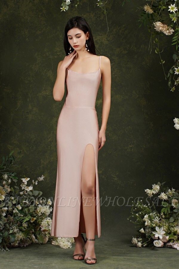
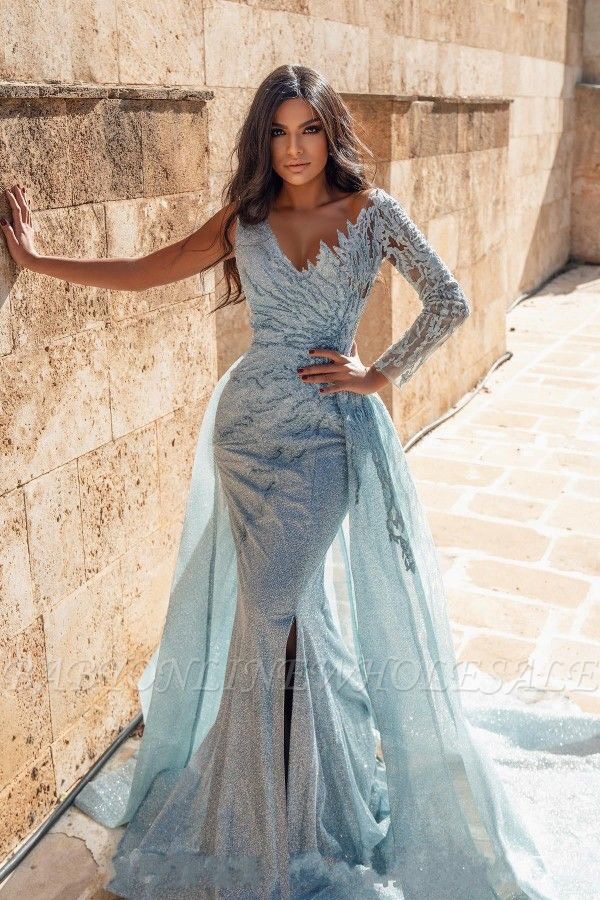
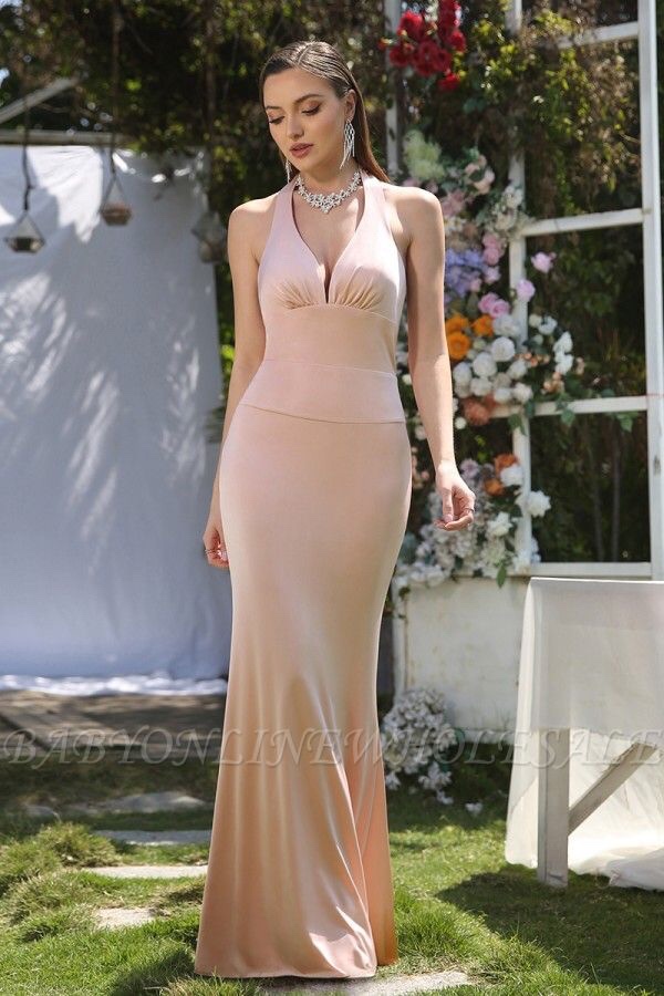
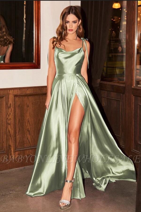
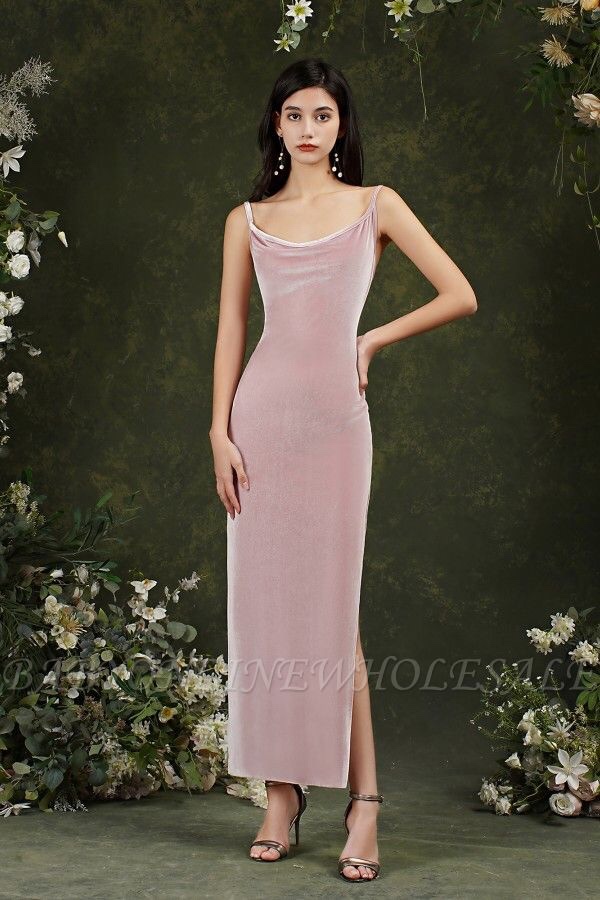
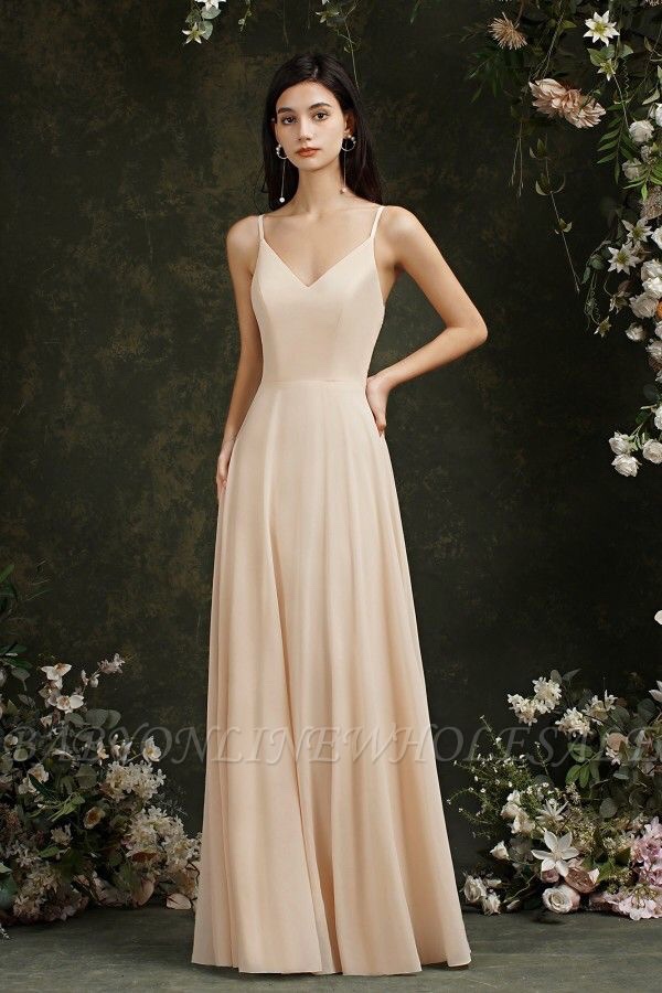
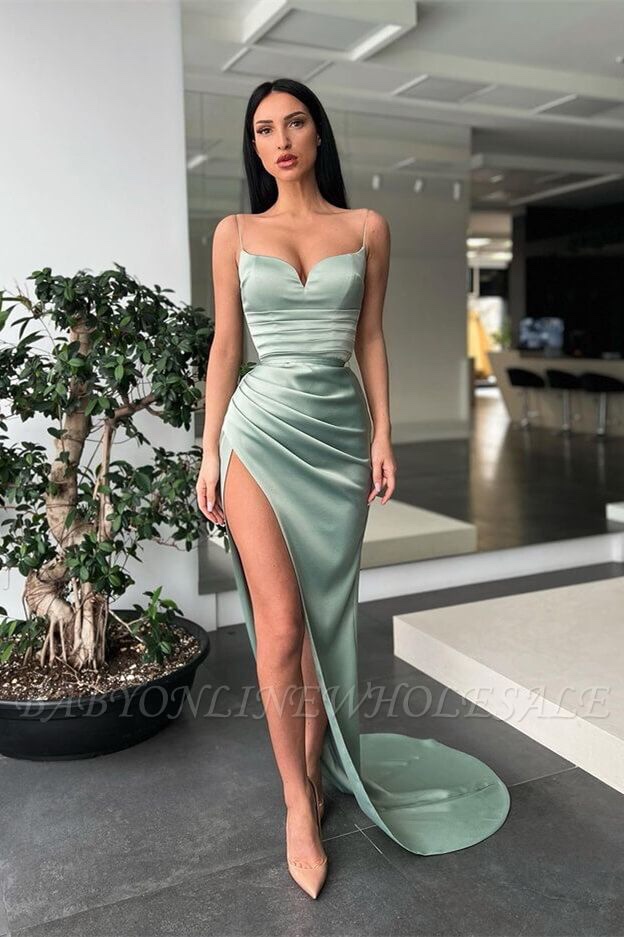
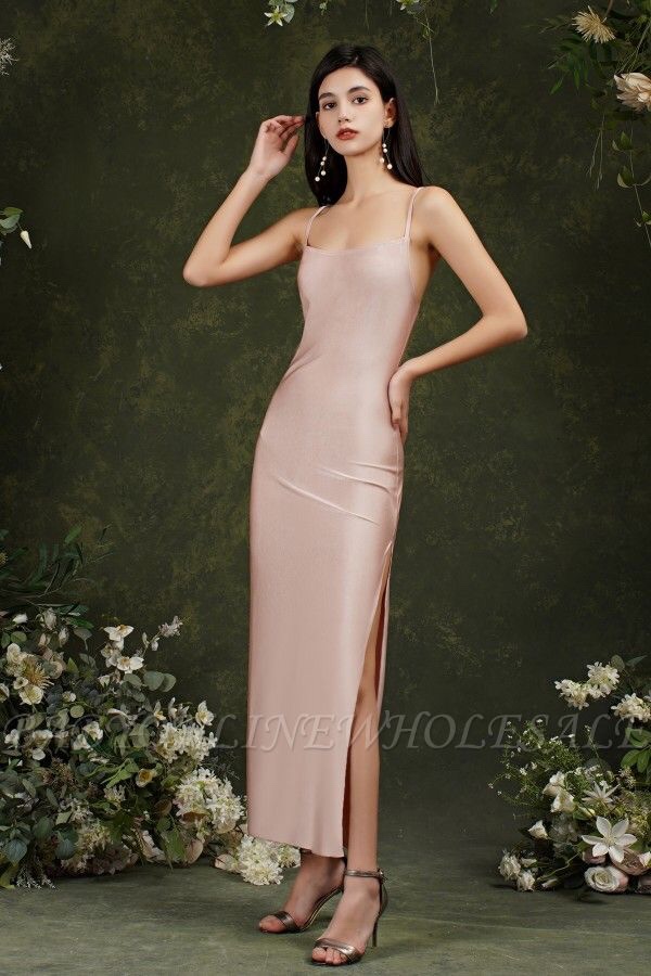
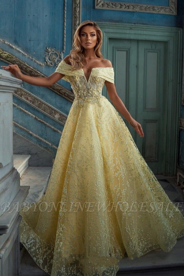
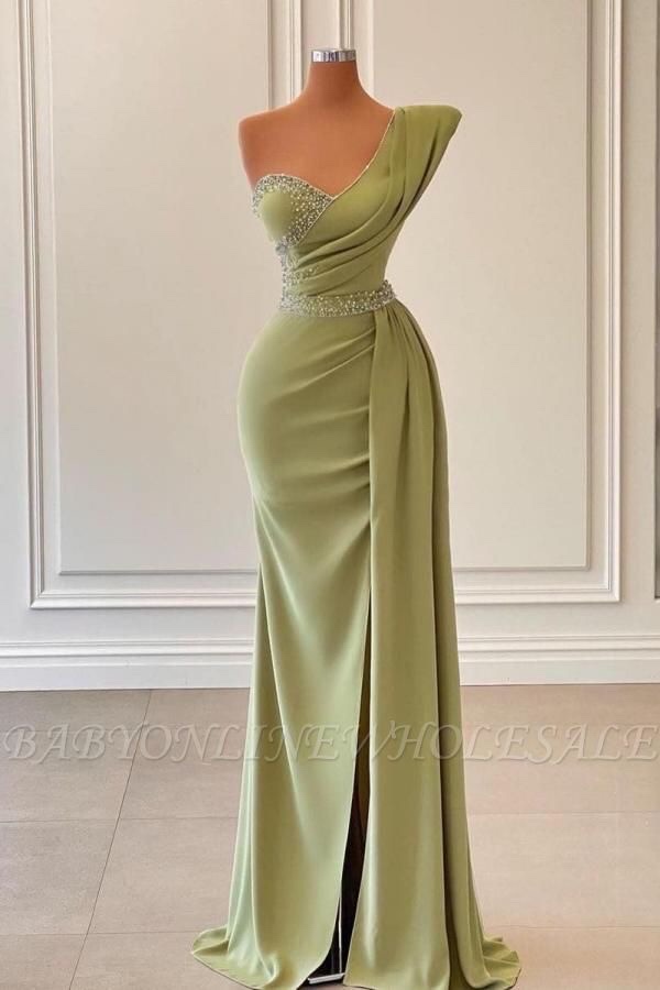
Some of the best known examples of pastel colors are: mint, pink or baby blue, peach and mauve.
Because of the serene emotional response these hues evoke, pastels are often associated with themes of spring and freshness. Also, these “washed out” colors are quite sophisticated and friendly when in action.
For example, designers can add an emotional quotient to their work just by including appropriate color schemes and pastel color palettes.
